Work With Us
Work defined by integrity in design and excellence in execution.
Intro To CWS’ Portfolio
A Word From Eric Smith The Founder
Over the past four decades, I’ve worked across multiple creative disciplines — directing music videos, producing original records, designing cover art, building websites, developing brand identities, and completing client-style production work through Full Sail University. I’ve also architected the full multimedia vision behind Creative Works Studios.
Many of these projects were developed in-house or for personal ventures — built from concept to completion with the same level of precision and intention we bring to client work.
Our portfolio is intentionally curated through select projects and private engagements. We prioritize craftsmanship, clarity, and excellence over volume.
CWS Portfolio
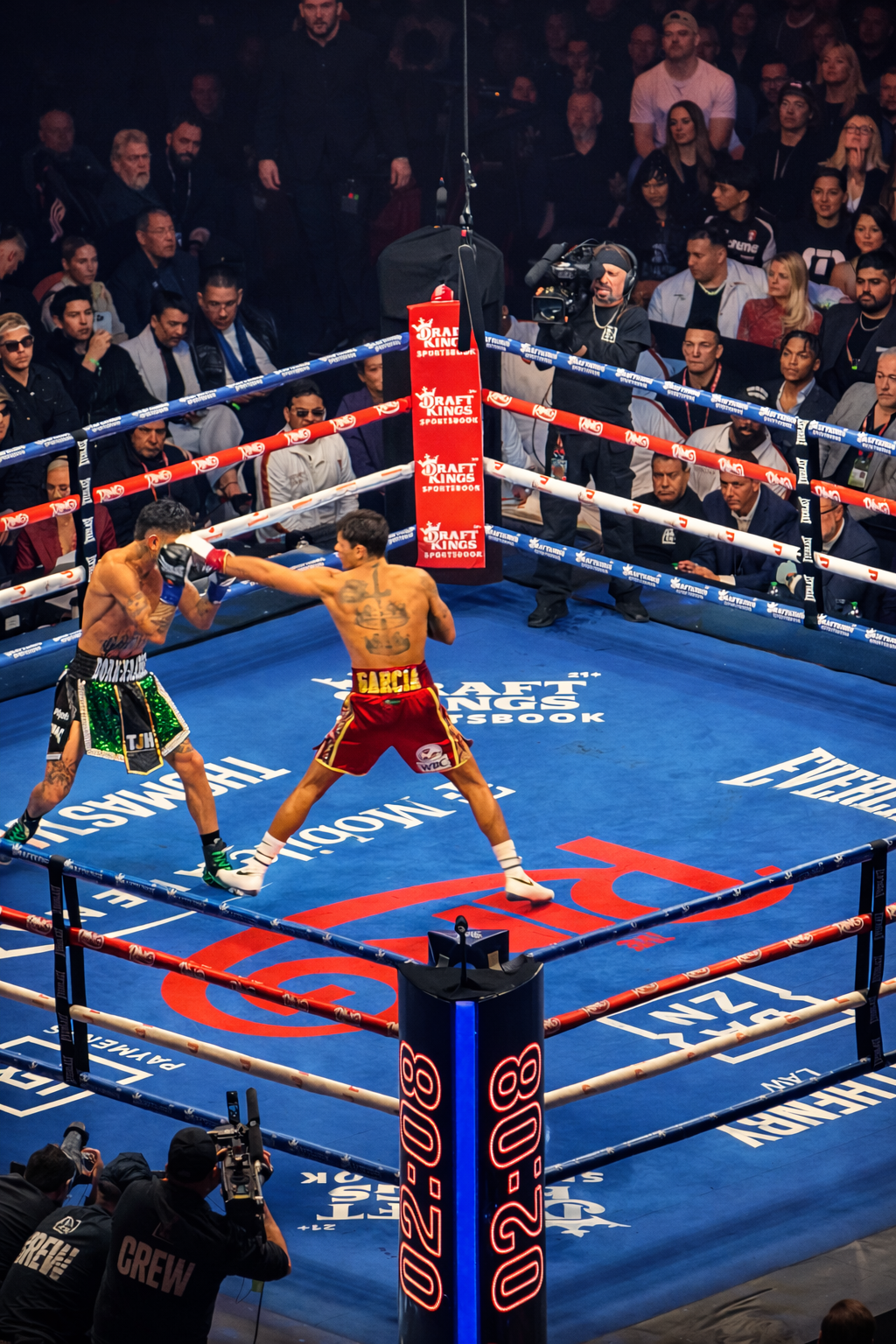
MODERN LOGOS Late 2010s to Present
"Bridging the Gap Between Persona and Icon"
The Vision: Bene Bronkos needed a national presence that felt authoritative yet enigmatic.
The Infrastructure: We developed a scalable typographic system that prioritizes legibility at 80mph while maintaining high-art sophistication.
The Impact: Successfully transitioned the artist from "independent performer" to "recognizable brand," evidenced by immediate fan engagement and national visibility.
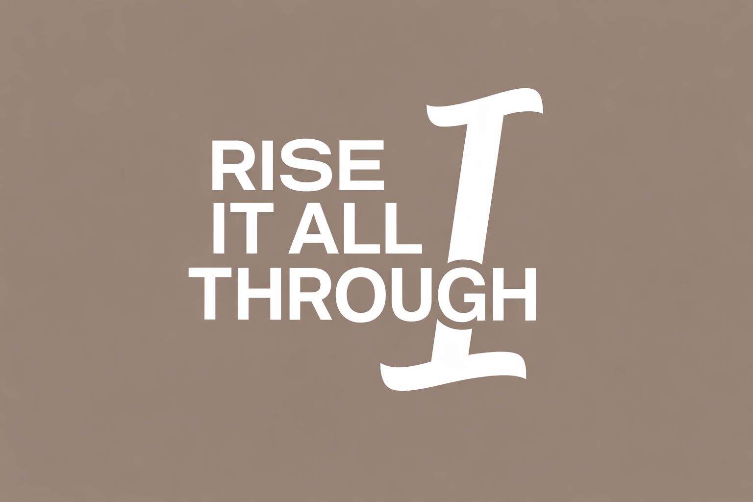
A clean, luminous identity study exploring the relationship between clarity and upward momentum. The rising arc symbolizes renewal and forward vision, while the refined typography grounds the mark in professionalism. Designed as part of CWS’ early-2020s concept work, this logo reflects a modern, confident brand language rooted in simplicity and quiet sophistication.
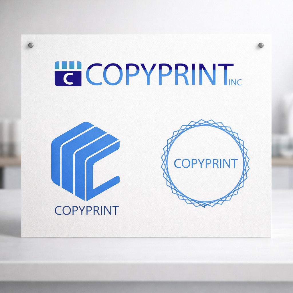
A clean, structural identity developed for CopyPrint Inc., a startup aiming to bring modern clarity to the traditional print and document space. The geometric mark and precise blue palette were designed to communicate reliability, efficiency, and a forward-thinking approach to everyday business services.
Though the company shifted direction shortly after branding—moving abruptly into the political sector—the work remains a meaningful part of CWS history. It represents an early season of growth, experimentation, and the formation of the disciplined visual style the studio would later become known for.
Explore a curated collection of our past work, where imagination meets strategy. Each project reflects our drive to deliver thoughtful, effective solutions.
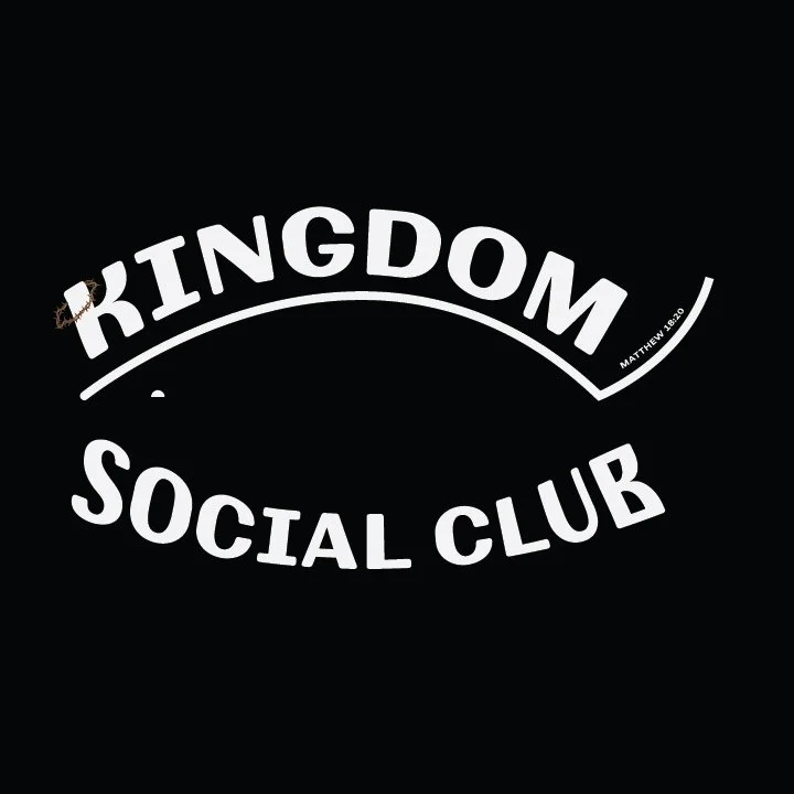
A bold, purpose-driven mark created for CWS’ charitable arm, Kingdom Social Club. The arched typography symbolizes covering, community, and the dignity of being seen — a quiet visual reminder that care is an act of leadership.
This identity represents more than design; it stands for over 4,800 meals shared with displaced individuals across Las Vegas, reflecting CWS’ belief that creativity and compassion belong in the same work.
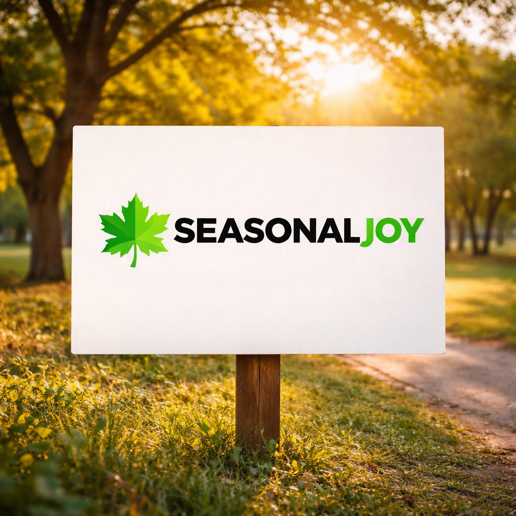
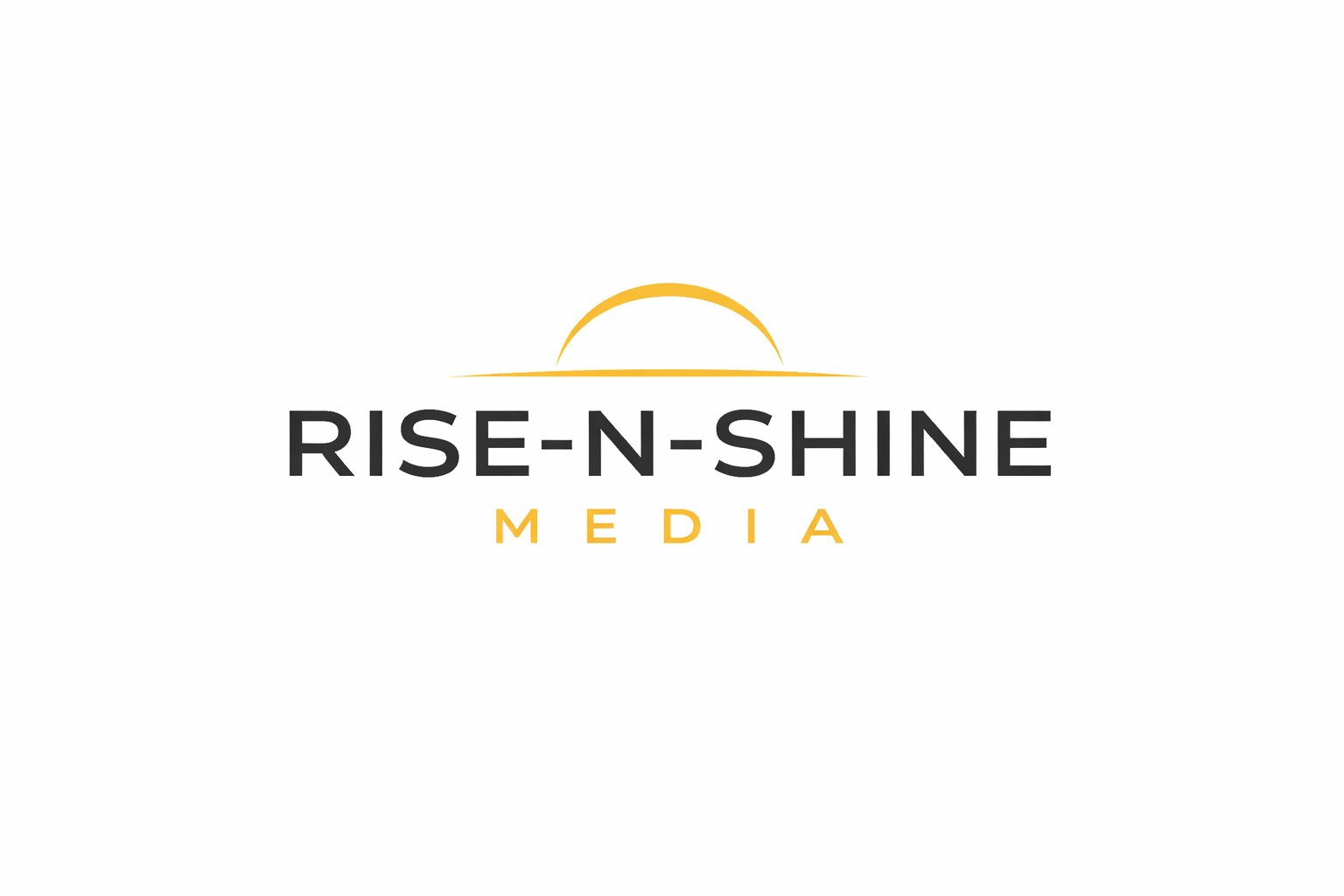
Designed in 2020, Seasonal Joy was an early exploration of community-focused branding that later evolved into the foundation of Kingdom Social Club. The bright green palette and stylized leaf symbol were crafted to represent renewal, generosity, and the steady hope people bring to one another in changing seasons.
Though the initiative would ultimately take on a new name and mission, this concept captures the moment when the heart of the project first took visual form—an important early step in shaping CWS’ approach to purpose-driven design.
Legacy Logos And More Soon