
The Recalibration of Authority:
A Designer's Blueprint for Navigating 2026
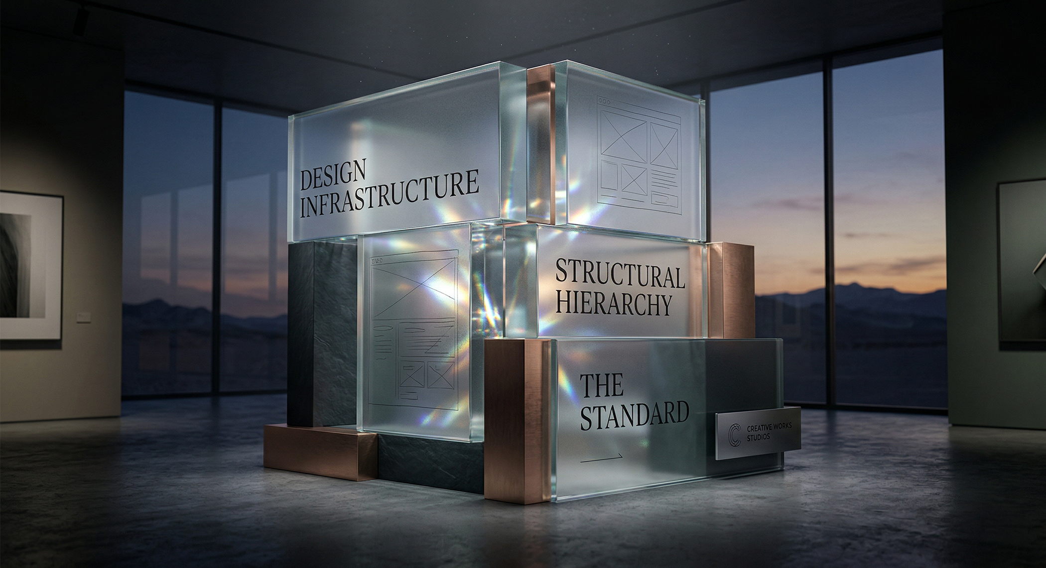
A sculptural arrangement of translucent glass and brushed metal blocks, etched with “Design Infrastructure,” “Structural Hierarchy,” and “The Standard,” anchors a minimalist interior in a polished visual statement by Creative Works Studios.
By Eric Smith
When I first started freelancing back in 2008, the digital design landscape was a completely different frontier. By 2016, as I began conceptualizing Creative Works Studios, a glaring reality became clear in Las Vegas: high-tier design agencies existed almost exclusively to serve the casinos. If you were a business outside of the gaming strip, you were left navigating a desert of mediocre creative services.
We built Creative Works to bring that high-tier architecture to everyone else. But today, independent designers are facing a new kind of desert: the absolute chaos of modern trends.
Right now, the industry is entirely fractured. We have hyper-minimalism coexisting next to outrageous maximalism, all while UI design resurrects the glossy, glassmorphic ghosts of the Windows Aero era alongside the new macOS. For a graphic designer trying to make sense of 2026, it feels like navigating without a compass.
If you are an independent designer trying to figure out what "good" looks like right now, this is for you. (And if clients reading this gain a new appreciation for the infrastructure of our craft, that’s a bonus).
Here is how you stop chasing chaotic trends and start building brand architecture that commands authority.
1. Ground the Chaos with a "Human Anchor"
When everything from ultra-minimalism to glossy 3D renders is trending at once, the only true differentiator is humanity. We introduce intentional, tactile friction to ground a brand in reality.
The Process for Designers: * Grain Mapping: Stop using cheap digital noise filters. Source high-resolution scans of actual 35mm film grain. Overlay them at precise, low opacity levels (3% to 7%) to create depth in otherwise "flat" vectors.
The "Hand-Drawn" Vector: Move away from mathematically perfect, sterile icons. Sketch concepts by hand, scan them, and trace them leaving slight "wobbles" in your paths. It maintains a bespoke, artisanal feel that cuts through the artificial perfection of AI-generated art.
Analog Textures: Use macro photography of physical materials—linen, heavy-stock paper, or brushed metal—as subtle background layers to give digital spaces a physical weight.
2. Treat Typography as Structural Engineering
In a fragmented aesthetic landscape, typography is your foundation. Don't rely on decorative fonts to do the heavy lifting. In 2026, we utilize typography as a structural, living element.
The Process for Designers:
The Institutional Serif: Anchor your designs with high-contrast, "Legacy Serifs" (like a modern Caslon or Bodoni variant) for headlines. When aesthetic trends get outrageous, a strong serif communicates instant, unshakeable trust.
Kinetic Sans-Serifs: For body copy and UI, learn how to implement variable fonts. Shift font-weight and slant dynamically based on user interaction or hierarchy needs.
Mathematical Hierarchy: Stop guessing font sizes. Use the Golden Ratio (1.618) to determine the exact relationship between your H1s, H2s, and body copy. Math scales perfectly; guessing doesn't.
3. Use Motion as Infrastructure, Not Decoration
With the return of heavy, Aero-style visual elements, it’s easy to overwhelm the user. Motion should never be added just because it looks cool; it must serve as functional guidance.
The Process for Designers:
Haptic Visuals: Design micro-interactions—like buttons that "depress" or links that fade with a smooth 200ms ease-in-out curve—to mimic the tactile feedback of high-end hardware.
Parallax Depth: If you are using heavy, glass-like UI elements, use scrollytelling. Make background elements move at 20% of the speed of the foreground. It creates an immersive, structured environment rather than a flat, cluttered page.
Entrance Logic: Elements shouldn't just "appear." Slide them in on staggered delays (50ms intervals) to create a visual waterfall that forces the user's eye to follow your intended narrative path.
4. Calibrate for "Quiet Luxury"
When maximalism gets loud, the most authoritative voice in the room is often the quietest. Move away from high-saturation "eye-burn" and embrace cognitive comfort.
The Process for Designers:
The 60-30-10 Rule: Calibrate your palettes mathematically. Use 60% dominant neutral (e.g., Obsidian or Champagne), 30% secondary tonal (e.g., Slate or Sage), and reserve only 10% for a high-authority accent color.
Material-Informed Hex Codes: Pull your color codes directly from the physical world. Sample the leather of a luxury car interior or the matte finish of a premium watch. It grounds your digital work in a reality the user inherently recognizes as "premium."
The Takeaway
Trends will always oscillate between extremes. But as a designer, your job isn't to perfectly mimic the current aesthetic—your job is to build a structure that outlasts it. Set the standard, and the rest of the industry will follow.
Are you navigating a rebrand or looking to architect a new digital presence? Creative Works Studios specializes in high-tier brand infrastructure. Let’s define your standard.